Color · June 2026 · 7 min read
Why Choosing Paint Is So Hard (and What the Light in Your Room Is Really Doing)
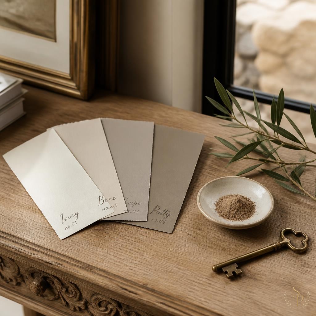
Of all the calls and texts I get from clients mid-project, more of them are about paint than anything else. Not fabric, not lighting, not furniture — paint. And usually some version of the same message: "It looked completely different in the store. It looks completely different in the kitchen. It looks completely different at night. Did I pick the wrong color?"
Almost always, the answer is no — the color is fine. The light is the problem. Or more accurately, the light is doing exactly what light does, and no one warned you. Paint is the most light-sensitive material in your home. Until you understand what light is actually doing in your specific room, you will pick the wrong color over and over.
Every paint color is a conversation with the light around it
A paint chip in a fluorescent-lit showroom is not the same color in your north-facing breakfast nook at 7 a.m., or in your west-facing den at sunset, or under your warm-white kitchen pendants at night. The pigments haven't changed. The light has. And because our eyes interpret color in context, the wall genuinely looks different — sometimes dramatically so.
This is also why your friend's living room — the one painted in the color you fell in love with — will not look the same in your living room. Different windows, different exposures, different time of day, different floors and trim bouncing different light back at the walls. Paint is never really one color. It's a color in conversation with everything around it.
What your room's orientation is doing
A quick field guide to the light you're working with:
- North-facing rooms get cool, even, blue-toned light all day. Warm whites can read gray here. This is where I lean into deeper, warmer colors — they actually feel cleaner than crisp whites.
- South-facing rooms get warm, generous light most of the day. Almost any color performs well, but very warm whites can tip yellow. Slightly cooler neutrals stay balanced.
- East-facing rooms get a bright, warm sunrise and then cool, indirect light by afternoon. Whatever color you pick will look like two different colors before noon.
- West-facing rooms get cool morning light and a flood of golden, orange-tinted light from late afternoon through sunset. Warm grays and creamy whites turn almost peach at golden hour. In Texas, this is dramatic.
- Texas light specifically is intense, warm, and high-contrast. Colors that look beautifully muted in a New England catalog often read brighter and warmer here. I almost always sample one shade quieter than my first instinct.
Why your artificial light matters just as much
Most of the time you spend in your home, the sun is down. So how a paint color looks under your lamps and overhead fixtures is at least as important as how it looks at noon. The bulb's color temperature changes everything. A 2700K warm bulb makes whites feel creamy and cozy. A 3500K bulb pulls the same wall toward gray. A 5000K daylight bulb (the kind in most big-box stores) makes everything look slightly clinical.
If your lighting plan is still being decided, hold the paint sample under the actual bulbs you intend to live with. Better yet, decide the lighting first — temperature, layering, dimming — and then choose the paint to work with it.
How to actually test a paint color
Small chips are useless. They're too small to read accurately, and the surrounding white card distorts your perception of the color. Here's how I sample paint with clients:
- Order large peel-and-stick samples (at least 12 by 12 inches) or have the painter brush out a two-foot square. Bigger is always better.
- Put samples on at least two walls in the room — one that gets direct light, one that doesn't. The same color will read differently on each.
- Look at the samples at the times of day you actually use the room. Morning coffee. Afternoon work. Family dinner. Late-night reading. If a color only looks right at 2 p.m., it's the wrong color.
- Hold the sample next to your floor, your trim, your largest piece of upholstery, and a fabric you love. Paint never lives alone — it has to play nicely with the room's existing palette.
- Sit with it for at least 48 hours before you commit. Your first reaction is almost never your final one.
Trust the process more than the swatch
Paint is the cheapest, most powerful design decision you'll ever make — and also the most humbling. Even with thirty years of experience, I still sample. I still get it wrong sometimes. I still test, repaint, and test again. That's not failure; that's the process. The clients who end up happiest are the ones who give the room a few days to show them what it really wants. The light will tell you. You just have to slow down enough to listen.